Code
knitr::opts_chunk$set(echo=FALSE, warning=FALSE, error=FALSE, message=FALSE)knitr::opts_chunk$set(echo=FALSE, warning=FALSE, error=FALSE, message=FALSE)| Pig | IL1B_Jej_pg_mL | IL1B_Ile_pg_mL | IL1B_Col_pg_mL | TNFA_Jej_pg_mL | TNFA_Ile_pg_mL | TNFA_Col_pg_mL | IL8_Jej_pg_mL | IL8_Ile_pg_mL | IL8_Col_pg_mL |
|---|---|---|---|---|---|---|---|---|---|
| P1 | 158.107 | 258.529 | 18.902 | 10.084 | 191.685 | 67.410 | 2717.095 | 3244.064 | 48.389 |
| C1 | 304.570 | 300.510 | 173.388 | 5.293 | 148.321 | 53.500 | 1807.191 | 2747.520 | 521.019 |
| HM1 | 126.749 | 92.684 | 80.020 | 0.000 | 163.895 | 0.000 | 2163.072 | 1842.670 | 93.936 |
| HM2 | 90.214 | 72.580 | 75.545 | 0.000 | 130.676 | 0.000 | 3434.170 | 3433.543 | 194.084 |
| HM3 | 114.224 | 79.751 | 239.901 | 0.000 | 0.000 | 28.050 | 1649.797 | 1678.069 | 334.678 |
| HM4 | 132.318 | 107.964 | 155.655 | 3.612 | 5.265 | 18.105 | 3390.124 | 3088.125 | 373.427 |
| HM5 | 68.657 | 49.695 | 12.045 | 0.000 | 112.351 | 0.000 | 3148.633 | 3153.588 | 172.843 |
| HM6 | 112.428 | 57.860 | 52.582 | 0.000 | 0.000 | 0.000 | 3088.206 | 4084.593 | 183.157 |
| P2 | 194.675 | 145.165 | 63.666 | 12.729 | 18.287 | 89.610 | 2474.794 | 2692.826 | 880.425 |
| C2 | 401.575 | 564.465 | 305.068 | 42.442 | 17.261 | 84.509 | 1635.162 | 1030.576 | 255.938 |
| IF1 | 174.037 | 130.035 | 38.956 | 0.000 | 105.243 | 3.978 | 2013.397 | 1678.351 | 49.232 |
| IF2 | 126.663 | 115.666 | 76.857 | 0.000 | 63.294 | 4.975 | 3399.788 | 1727.786 | 116.573 |
| IF3 | 141.120 | 53.064 | 182.891 | 4.574 | 0.000 | 12.948 | 3766.222 | 504.454 | 38.554 |
| IF4 | 132.275 | 78.283 | 18.266 | 9.628 | 154.257 | 0.000 | 3705.406 | 2293.403 | 222.193 |
| IF5 | 111.800 | 91.316 | 82.741 | 0.000 | 223.890 | 4.293 | 3228.713 | 2499.064 | 103.378 |
| IF6 | 159.411 | 120.352 | 31.099 | 0.000 | 5.171 | 0.000 | 2001.489 | 2659.008 | 173.974 |
I am adding in my DATA DICTIONARY from Assignment 2:
Just one excel sheet with items and attributes.
In Cytokine_summary, there are 16 pigs. P1 and P2 were pilot pigs fed piglet milk replacer formula. C1 and C2 were farm control pigs (siblings) raised at a farm (the same one as the other pigs), feeding from their own mom, and then we received them for necropsy on day of life (DOL) 28. HM1-6 were fed human milk for 28 days in our lab. IF1-6 were fed infant formula for 28 days in our lab. Pairs of HM and IF (such as HM1 and IF1) were siblings and both raised at the same time, but in different cages.
In Cytokine_summary, there are 10 variables. One of these columns = “Pigs” and specifies the observations described above. All other variables are cytokine values from ELISAs on various intestinal tissues harvested fromt the pigs at necropsy on DOL 28 (except HM/IF5- they had to stay with us a little longer). Detected ELISAs tested included IL1B, TNFA, and IL8. Each of these cytokines were tested on the jejunum (Jej), ileum (Ile), and Colon (Col) of each pig. Concentration units of for each measurement were in pg/mL.
Now that I have the necessary data and packages, I want to make a box blot distribution of my various cytokines per pig feeding group - HM, IF, P, and C. Barrie helped me with this!
Here we add another column into Cytokine_summary via R
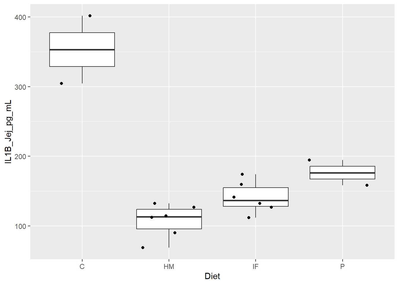
Figure 1. Box and whisker plots displaying piglet diet group differences in expression levels (pg/mL) of the pro-inflammatory cytokine IL1B in the jejunum. Jitter overlay is representative of each individual pig.
C = Farm Control
HM = HM
IF = IF
P = Lab Control
Now I could create individual ones of these for each column… but we are going to try to work smarter, not harder, and create a new data frame to get all these types of plots into 1 figure.
First we break up the columns 2-10 to their cytokine and their region.
Cytokine_long looks good!
Now to put that into a boxplot with jitter overlay. We facet_wrapped in order to make subplots from 1 plot (slice it up for the viewers).
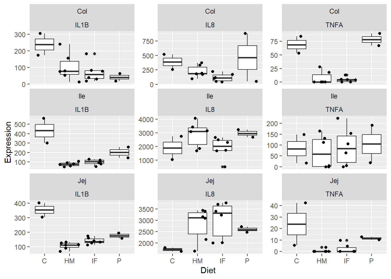
Figure 2. Box and whisker plots displaying piglet diet group differences in expression levels (pg/mL) of the pro-inflammatory cytokines IL1B, IL8, and TNFA in the jejunum, ileum, and colon. Jitter overlay is representative of each individual pig.
Great!
Moving forward from Figure 2., we wanted to see if there were any individual pigs driving differences.
Make new data frame for Cytokine z-scores
Make a boxplot now:
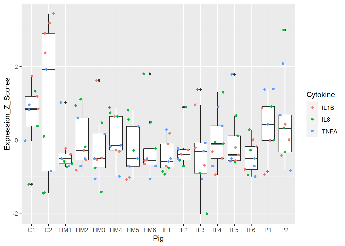
Figure 3. Box and whisker plots of individual pigs and their overall cytokine expression z scores. Colors represent respective cytokines.
Super cool! Each pig has 9 dots = 9 cytokines readings (3 cytokines and 3 regions). Doesn’t appear to be any real outlier pigs as a whole (i.e. none are extremely inflamed or non-inflamed for any measure). This shows us there doesn’t appear to be hidden structure in my data.
ACTION = SEARCH
TARGET = ALL DATA
What if I add the CHANNEL of another dimension of FILL/COLOR to Figure 3?
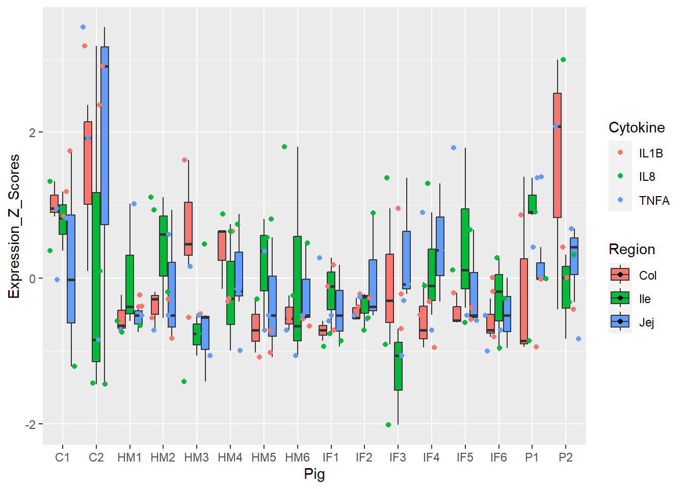
Figure 4. Box and whisker plots of individual pigs and their overall cytokine expression z scores. Colors represent respective cytokines and respective regions.
Actually, this might be quite helpful! Hmm… different colors?
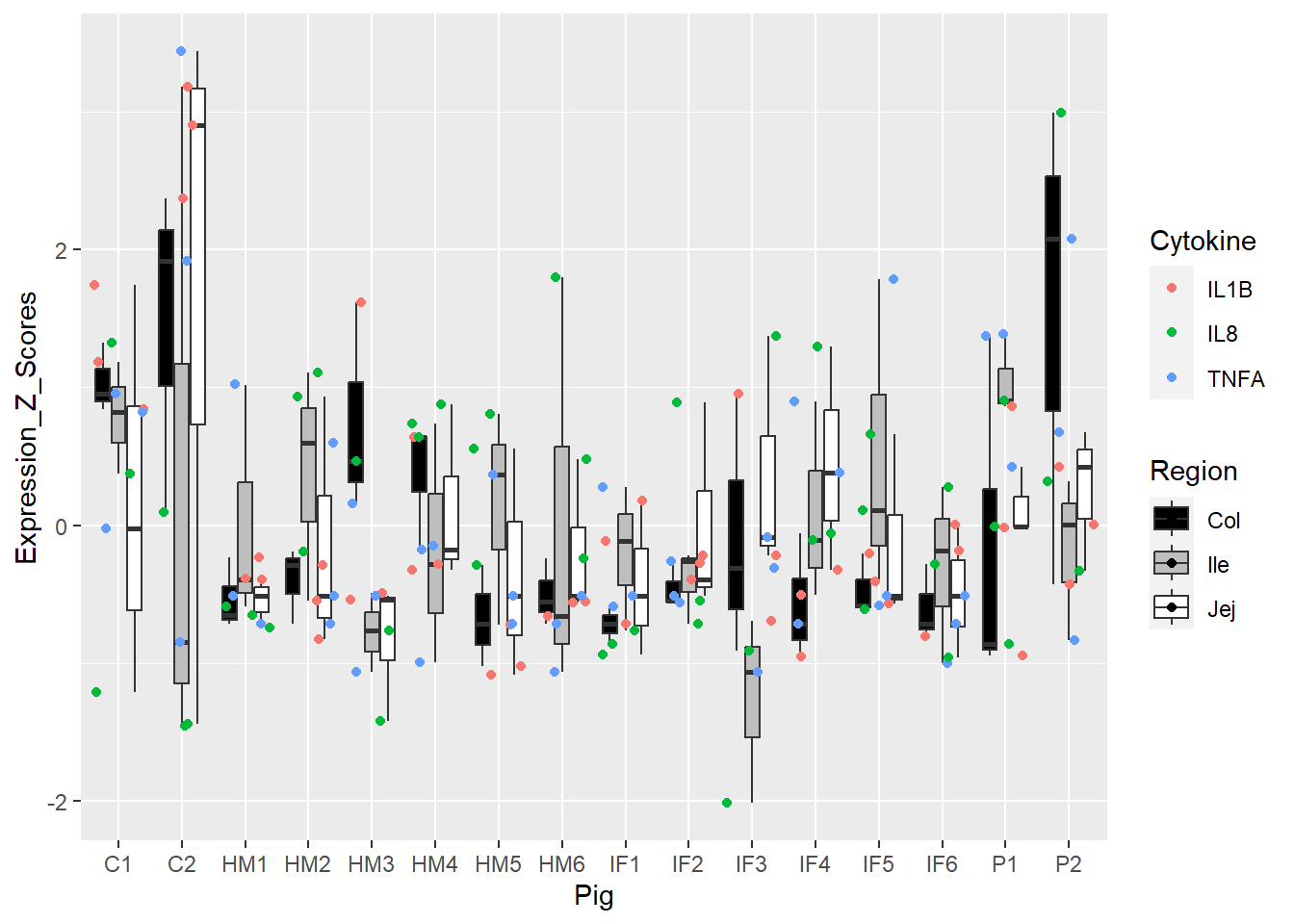
Figure 5. Box and whisker plots of individual pigs and their overall cytokine expression z scores. Colors represent respective cytokines and respective regions.
Helpful or a hindrance, I don’t know!
How about changing the MARK of SHAPE?
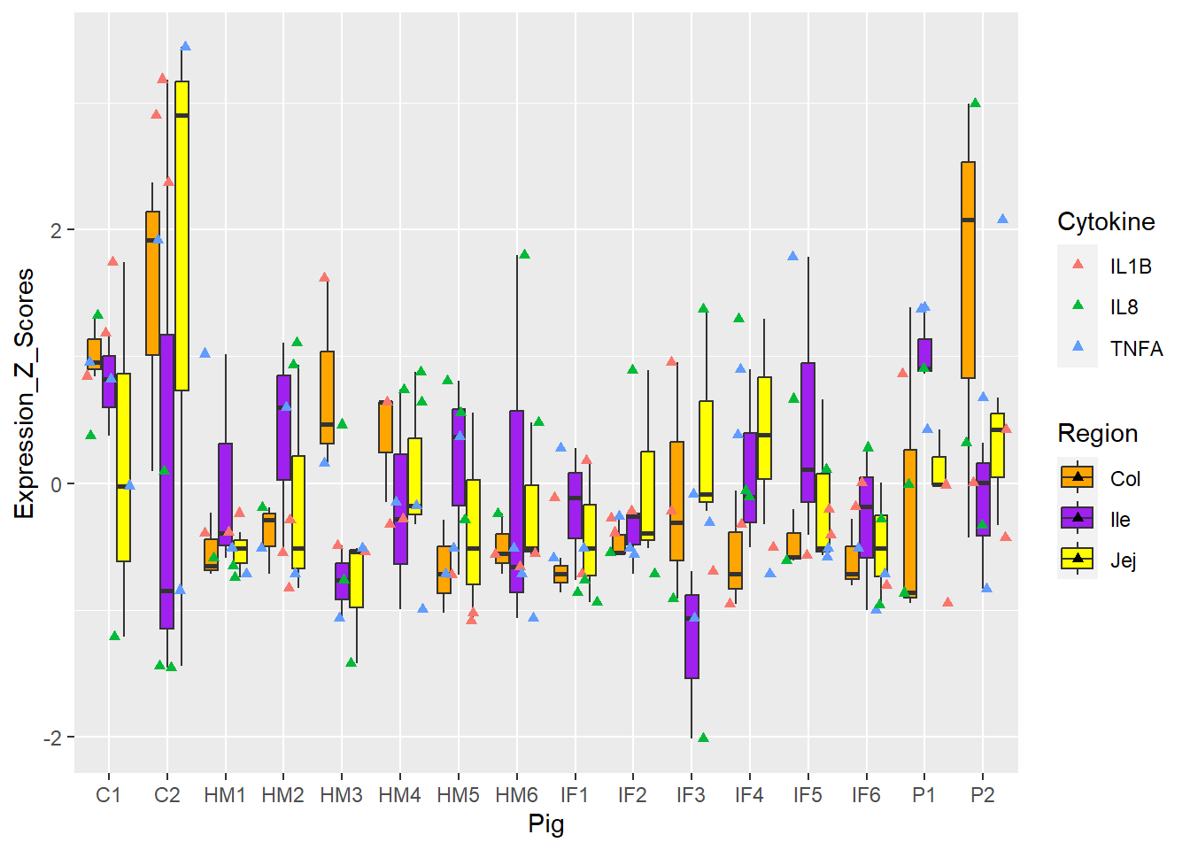
Figure 6. Box and whisker plots of individual pigs and their overall cytokine expression z scores. Colors represent respective cytokines and respective regions.
Alright… I am having too much fun here. Lastly, for my micro-pig-ome data, Barrie and I worked on relative abundance stacked barcharts. I won’t go into it too much, but the data I am importing below are microbiome samples (from piglet fecal samples) representative of various timepoints. I want to manipulate the CHANNEL of COLOR to be a little more discriminating.
The following was copied from my pre_decontam project:
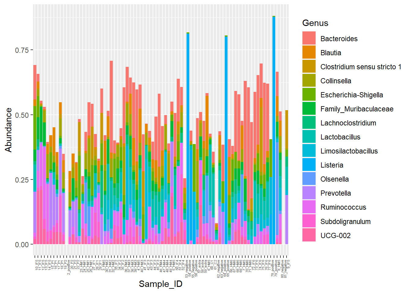
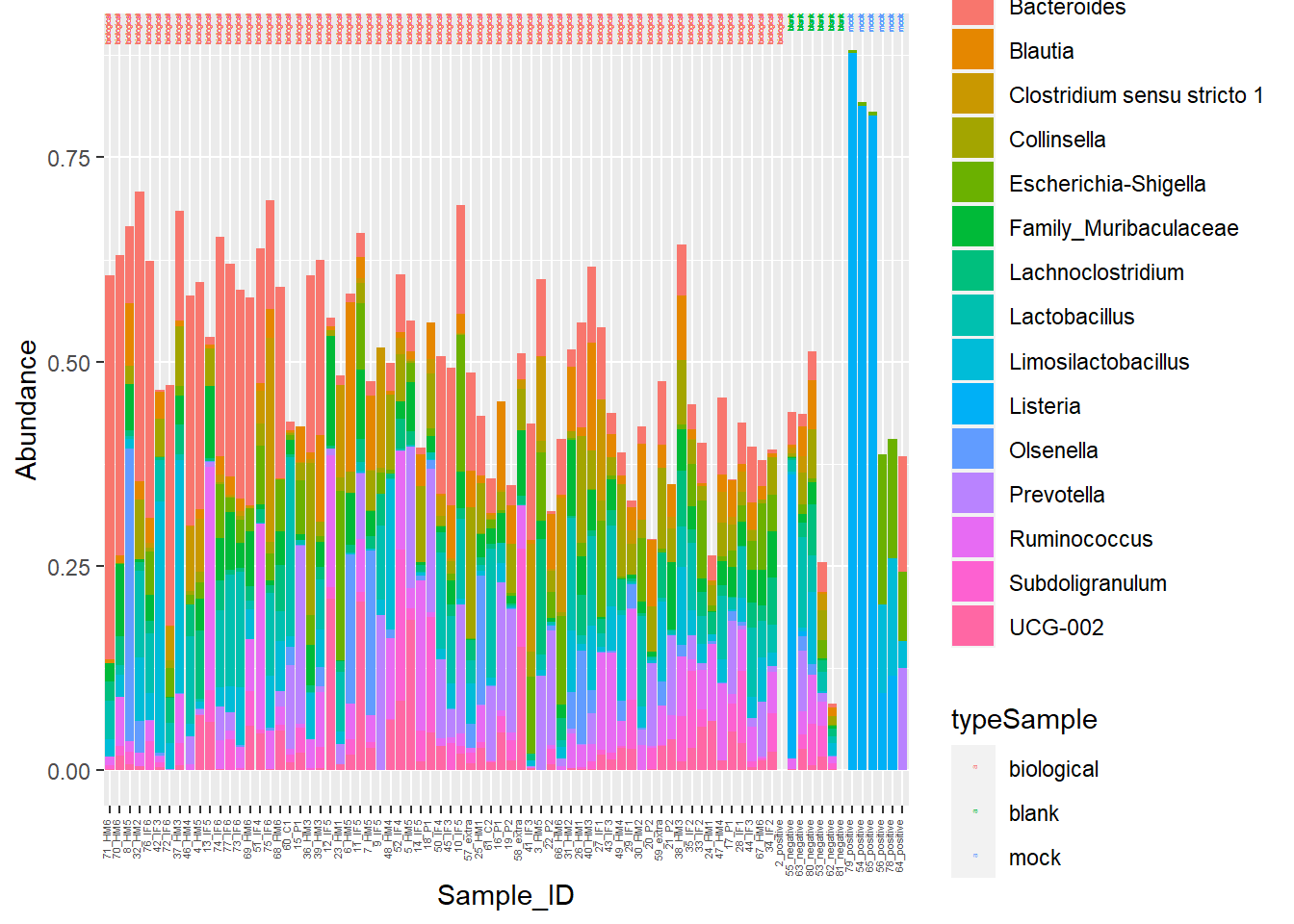
Figure 7. Piglet microbiome relative abundances with poor color
I am going to manipulate color now!
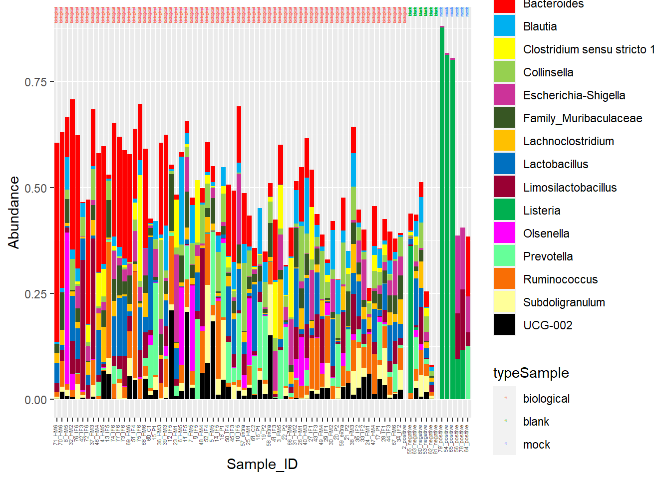
Figure 7. Piglet microbiome relative abundances with better color!
Show by Figures 3, 4, 5, and 6.
Figure 3 and 5 = best, 4 and 6 = meh!
Figure 4 fine-tuned Figure 3 by GI region.
However, Figure 5 tried to add in more colors, and ultimately, this just added to the cognitive load. Not sure how to use Region helpfully without overstimulating/confusing.
Head to Figure 7. Gut microbiome stacked barcharts are a little easier to distinguish with the updated color scheme.
We were searching for popout in Figure 3. I do notice C2 is a bit of a bigger box compared to the rest.
Thanks! TTFN!